First, thanks for all the positive feedback from my earlier post, What’s Wrong With the US Hotel Industry Recovery? Regardless of the pithy and enlightened analysis provided (my personal and unbiased self-assessment) there was a select group of readers that remained unappeased.

For those who requested a broader statistical comparison, all I can say is ‘You want more numbers… Are you serious?’
Photo Credit: Patrick Gage | Flickr
There appear to be two categories of hotel industry data aficionados – gourmets and gourmands. You may know them better as the Smith Travel Research, Colliers PKF and PricewaterhouseCoopers fanboys & fangirls you see hanging out by the stage at the Hotel Data Conference.
The gourmands revel in devouring every data point in sight. They like their data raw and in large quantities. One would imagine these folks drink their wine from boxes and buy sides of beef that they cut themselves. Not afraid of getting their hands dirty, they have no use for utensils, but prefer to dig their teeth directly into their meal like lions savaging their prey.
The gourmets are a but more refined – They savor the nuanced flavors of the freshest, meticulously prepared, and most creatively presented information available. They prefer the finest cuts from the finest chefs, with portion size and cost being irrelevant as long as the quality is there. They even look at well aged data like wine – given expert handling and loving care, even the oldest statistics can yield valuable insights and points of comparison for the latest growths.
Despite my initial inclination to help organize interventions to get these individuals into some form of hospitality stats junkie 12-step program, I cooked up a few more data dishes as a belated holiday buffet.
Background
The premise of the earlier post was that the US hotel industry was recovering, somewhat, but that it still had considerable territory to cover before regaining the profitability seen in 2007 & 2008. To illustrate the point, there were three small graphs comparing the years 2006 through 2010 for the half year period comprising weeks 24 – 49, or approximately from mid-June to early December.
The data source is a compilation of the weekly US hotel performance statistics collected by STR Global and presented on their excellent HotelNewsNow site.
The 26-week time frame was selected because it not only ideally framed the dates providing key milestones in the hotel industry economic meltdown in 2008, but also captured peak leisure travel periods in the summer and business travel periods in the autumn.
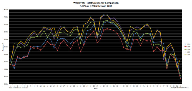
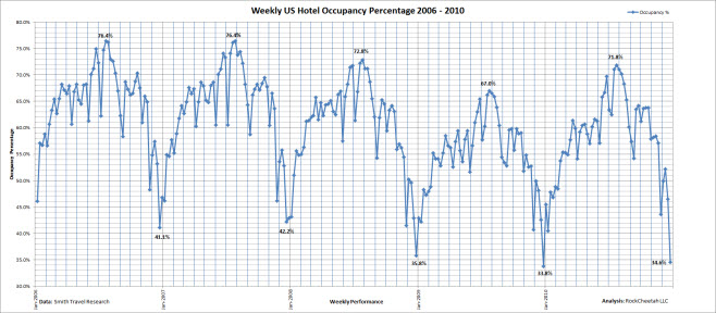
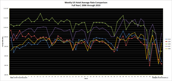
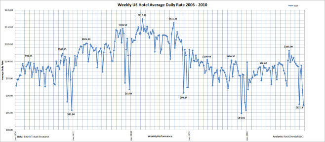
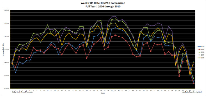
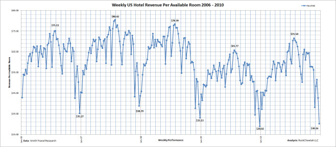
To offer a more complete picture of the US hotel industry as a whole over the past five years, below are full year-over-year comparisons of the three bellwether metrics for the global hotel industry: Occupancy Percentage (Occ), Average Daily Rate (ADR) and Revenue Per Available Room (RevPAR.) Additionally, a linear presentation of the same data is provided to more clearly illustrate the trends over time.
Finally, a few tables summarize the peaks and valleys for each corresponding metric over the respective five year span. The combination of this information clearly depicts the US hotel industry as showing marginal improvement over the depths of the recession in 2009, but far from nearing the heady performance of 2007 & 2008.
It appears that the “New Normal” predicted in the November, 2009 Views from a Corner Suite post US Hotel Performance – Time for a Baseline Reset? is becoming a reality.
In the interest of letting the data junkies arrive at their own conclusions, I will limit my analysis to a few key points in each area. Your insights however, are most welcome – especially contrasting opinions – so feel free to contribute comments.
So here is the bigger picture:
NOTE – For a literally larger picture, please click on each image for a full-size view of each chart)
Occupancy Percentage
|
|
2006 |
2007 |
2008 |
2009 |
2010 |
|
Peak |
76.4% |
76.4% |
72.8% |
67.0% |
71.8% |
|
Valley |
41.1% |
42.2% |
35.8% |
33.8% |
34.6% |
Source: STR
While showing nearly a five percentage point increase over 2009 peak summer occupancy, 2010’s 71.8% top occupancy percentage falls almost the same distance behind the summer occupancy peaks of 2006 and 2007.
The occupancy valleys indicate a deeper challenge – the December 2010 low point was only 0.8% higher than the corresponding valley in 2009. the 34.6% occupancy percentage remains 6.5 points below the valley recorded in 2006.
Occupancy is clearly increasing, but reports that the strength is typically manifesting itself in major demand centers during peak travel periods does not necessarily reflect the health of the general US hotel industry as a whole.
Average Daily Rate
|
|
2006 |
2007 |
2008 |
2009 |
2010 |
|
Spring Peak |
$99.75 |
$105.30 |
$112.36 |
$100.44 |
$98.67 |
|
Fall Peak |
$102.25 |
$109.52 |
$111.25 |
$100.30 |
$103.09 |
|
Valley |
$85.74 |
$91.86 |
$90.84 |
$84.81 |
$87.13 |
Source: STR
There are normally two peaks for average rates during the year – in spring, and in fall – corresponding to prime periods for business travel.
Clearly, average rates peaked in 2008 as indicated in both the spring and fall periods at ADR’s exceeding $110.00 US.
The good news for peak average rates was that the 2010 fall peak of $103,09 exceeded not only exceeded 2009, but also 2006. It is unclear how much joy hotel owners might be expressing for beating a five year old rate level…
The bad news is that the 2010 spring peak was below both the 2009 and 2006 figures. That is somewhat depressing.
One important metric to watch moving into 2011 will be the spring peak average rate. In 2007 & 2008, the spring peak was higher than the previous fall peak. In 2009 & 2010, that pattern was reversed.
If the 2011 spring peak is higher than the 2010 fall peak, there may be cause for guarded optimism that the US hotel industry is managing to get rate increases to stick.
On the topic of average rate valleys, what more can be said? The death spiral has been curtailed, but that is not the full story.
2010 weekly average rates started the year lower than 2006, but moved forward to consistently better them until just after the October peak, when they again fell below 2006 levels.
Comparing early 2011 average rates with comparable weeks in 2006 will be a good indicator of strength, weakness, or perhaps, the new normal.
Revenue Per Available Room
|
|
2006 |
2007 |
2008 |
2009 |
2010 |
|
Peak |
$75.11 |
$80.42 |
$78.39 |
$65.77 |
$71.54 |
|
Valley |
$35.27 |
$38.79 |
$33.13 |
$29.02 |
$30.16 |
Source: STR
Given that RevPAR smooths out the tradeoffs between occupancy and average rate, it has become the single go-to stat to cut through marketing strategy and focus on performance.
While many would argue, myself included, that GOPPAR (Gross Operating Profit per Available Room) is a much better proxy for profitability, it is not widely used, nor broadly available.
Again, while the 2010 peak was $5.77 higher than 2009, it still fell $3.57 below the next lowest peak in 2006. 2007’s peak, hitting $80.42 rests a whopping $8.88 above the 2010 level.
Again, considering the valley, managing to stay above the $30.00 mark is not considered bragging rights.
The 2010 valley of $30.16, while above the unimaginably dismal $29.02 of 2009, remains a distant $8.63 below the 2008 valley. One more factor to give weight to a new normal being established for the US Hotel Industry.
RevPAR is critical, given the distressed state of many hotel assets, strategies to capture cash flow by driving occupancy with deep discounting.
If the hotel industry can sustain meaningful rate increases – ideally, growing at a pace faster than occupancy increases, there will room for optimism concerning a true recovery as opposed to stabilization.
Hopefully these stats will provide a pleasant degustation to satisfy both the gourmets and gourmands of US hotel industry performance data.
It will be very interesting to see how 2011 develops. Hopefully it will be a prosperous year for US hotel owners and operators.
